Case Study · 2017–2019
Platform Design
Solving cross-vertical design problems
Solving cross-vertical design problems
I joined Nextdoor as their second designer, just as they were celebrating their 100th neighborhood. My last week was over 9 years later, just as the company was going public. It was a long run that afforded me a range of opportunities—leading the company onto iOS and Android, designing features that pushed us in new directions, establishing our first design system, and leading prod-dev teams as a PM. Here’s a survey of some of the platform oriented design work I led.
Over my first 5–6 years at Nextdoor, the design team operated with little formal structure around typography, color, icons, etc. and consistency was managed through team reviews and ad hoc conversations. As the team and product grew this became unsustainable and consistency suffered. I dug in, looking at code to catalog the colors, type styles, and icons currently in use. The results were wild—I found over 80 different shades of gray, for example.
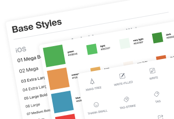
From this research, and in collaboration with the rest of the design team, I developed a design system, NDUI, that established a fixed but flexible color palette, a typography system, a comprehensive set of icons with a consistent visual language, and a set of reference mockups and UI components.
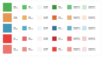
A theme I explored in the design of NDUI was resilience to change. For example, if a key brand color is tweaked, how many touches to mockups and code are needed to implement the change? In my experience, systems that required a lot of work to effect a change were hard to establish and maintain over time.
The color system addressed this by using computed tints and shades of a small set of base colors. Any change to a base color would ripple out automatically in design tools and code.
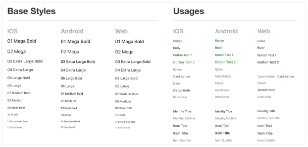
The typography system used a two layer design—a descriptive set of Base Styles that defined typeface, weight, and size and a semantic set of Usages served as the actual interface for designers. Under the hood, a Usage specified a Base Style. This loose coupling of usage and type specs made changes easy (one change in a library file or a line of code) and their impact isolated (changing “Button Text 1” doesn’t change other stuff). This also allowed for platform-specific differences to be incorporated into the system—so, iOS might implement “Button Text 1” slightly differently than Android but the designer doesn’t have to necessarily know that when designing a feature.
Initially, the design system was implemented only in Sketch but was immediately invaluable in establishing consistency and making it generally easier and faster to mock stuff up. About a year later I shifted my role to PM of Nextdoor’s front-end infrastructure team where I led the team through a complete implementation of the type, color, and icon systems on all platforms. We also kicked off a new UI component library and documentation center and rebranded the whole system as Blocks.
Leading the front-end team also afforded me the opportunity to tackle accessibility. This was not something that anyone at any level had spent time on at Nextdoor, which is to my own personal shame a bit, given my past as an academic researcher on non-visual interfaces.
To get this onto the team's roadmap I needed to 1) establish the severity of the problem, 2) make a case for why solving it matters, and 3) present a plan for addressing it. The first was the hardest—I spent about two weeks auditing all main surfaces of the product across web, iOS, and Android and capturing where we fell afoul of WCAG 2.1 guidelines. This audit made it clear that the product was practically unusable to anyone using assistive technologies and difficult to use for anyone with mild vision problems.
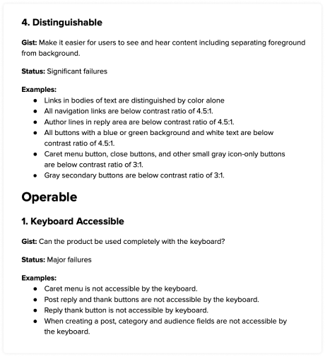
The case for why we should address the issues in the audit was an easy sell—Nextdoor leadership agreed with me that we were failing in our mission to connect all neighbors. There was no fiscal case to be made, although lowering the risk of a lawsuit probably didn’t hurt.
Working with the team’s engineers, I developed a plan to spend one quarter fixed the identified issues—essentially digging us out of the hole. More importantly, though, was a plan to establish practices that ensured we didn’t develop new accessibility debt. I developed a “road show” to educate engineers, designers, and PMs about accessibility problems and solutions and presented to every prod dev team in the company. I also worked with engineering leadership to bring accessibility testing into our QA and verification processes.
Ultimately, over two quarters we brought Nextdoor’s web, iOS, and Android apps into WCAG 2.1 AA compliance, educated the entire company about accessibility, and established practices to ensure we continued to serve all neighbors. I also started an accessibility co-op group to ensure we were continually learning and growing new internal champions and experts.
Another type of problem I frequently worked on was “horizontal” systems that cut across the concerns of Nextdoor’s vertically-oriented teams. These systems tended to fall between the cracks and languish with persistent problems that were hard to find an owner for.
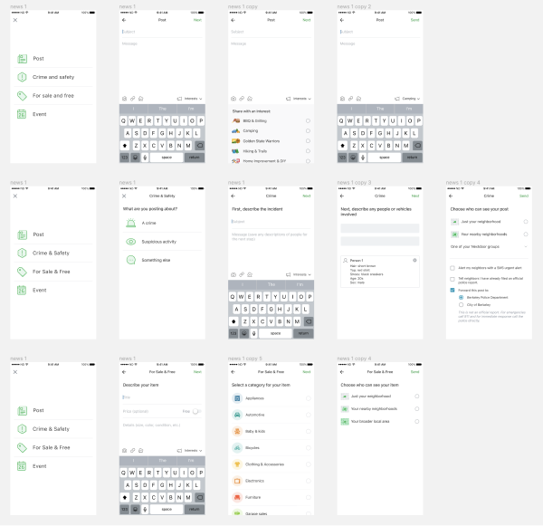
Nextdoor has a surprisingly complicated content ecosystem—posts and comments, of course, but also events, for sale listings, real estate listings, business pages, and more. Over the years, this led to Nextdoor’s post flow becoming increasingly inconsistent and brittle, with some portions being generations behind others in terms of design and implementation.
Knowing there were multiple teams who were soon going to mucking around in the post flow, I led the frontend infra team through a “replatforming” of the whole post flow. This started with a new design that normalized all the flows with a consistent design and ended with a clean and extensible implementation.
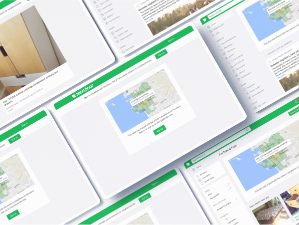
The complex content ecosystem got even gnarlier when considering shared content. At the time, most content required the user to be signed into a Nextdoor account and some content, like newsfeed posts, was restricted to a specific set of neighborhoods. Users who got a link from a friend and tried to view the content would be met with aggressively unhelpful 404 page.

I addressed this with a UI that referenced the specific content as much as possible and anchored it in the neighborhood it originated from, both of which created momentum to sign in or sign up. The team was able to implement this unified approach across dozens of different content and scope scenarios.